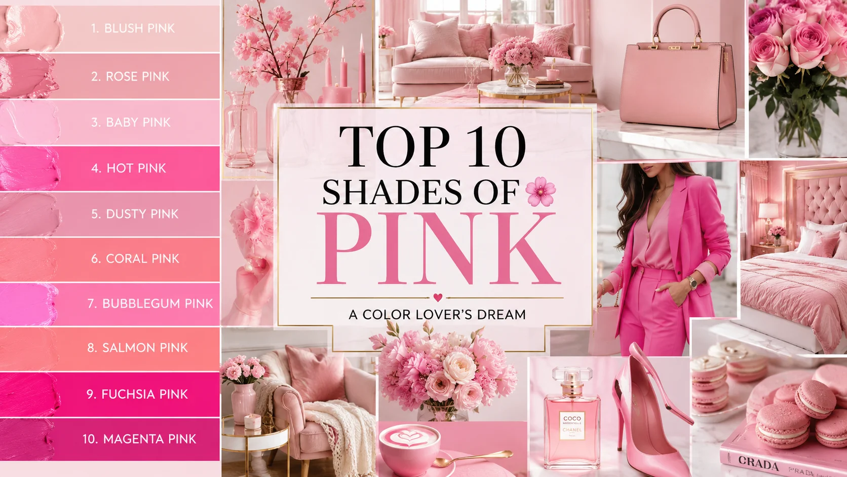
Top 10 Shades of Pink: Beautiful Pink Color Ideas for Every Style
10 Shades of Pink: Pink is one of the most versatile and beloved colors in design, fashion, home décor, and creative projects. From soft romantic blush tones to vibrant, energetic hot pinks, this color family offers endless inspiration for Pinterest lovers looking to create beautiful spaces and eye-catching aesthetics. Whether you’re decorating a bedroom, planning a wedding, refreshing your wardrobe, or designing social media graphics, the right shade of pink can completely transform the mood.
In this guide, we’ll explore the top 10 shades of pink that continue to dominate Pinterest trends. Each shade has its own personality, style, and creative possibilities, making it easy to find the perfect pink for your next project.
1. Blush Pink
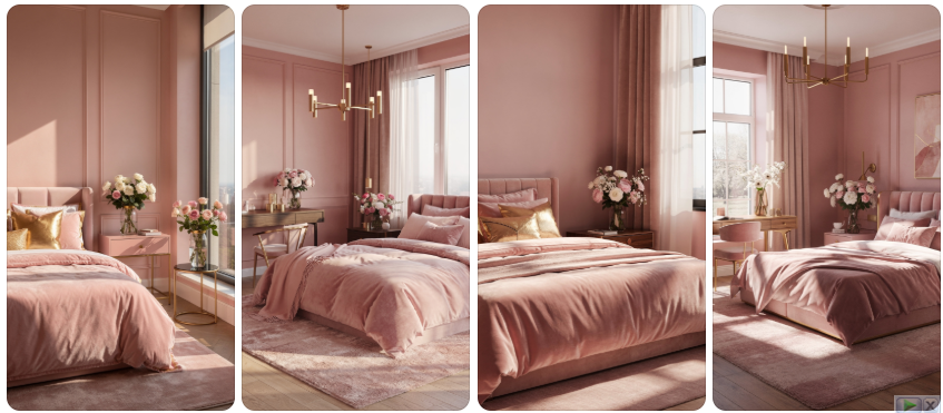
Blush pink is the ultimate symbol of elegance and softness. This gentle shade combines subtle warmth with a calming presence, making it one of the most popular pink tones on Pinterest. Homeowners frequently use blush pink in bedrooms, living rooms, and nurseries because it creates a welcoming atmosphere without overwhelming the space. The color pairs beautifully with neutral palettes such as cream, beige, ivory, and light gray, allowing it to blend seamlessly into modern and traditional designs alike.
Fashion enthusiasts adore blush pink for its timeless appeal and versatility. Whether featured in cozy sweaters, flowing dresses, or sophisticated accessories, this delicate hue flatters a wide range of skin tones and works across all seasons. Many designers incorporate blush pink into bridal collections because it offers a romantic alternative to pure white while maintaining a graceful and refined appearance that photographs beautifully.
Beyond fashion and interiors, blush pink shines in branding, event planning, and social media content creation. Its gentle nature conveys warmth, kindness, and sophistication, making it a favorite among lifestyle brands. Pinterest users frequently save blush-themed mood boards filled with floral arrangements, wedding inspiration, and cozy home setups that showcase the shade’s ability to create dreamy, visually appealing environments.
2. Rose Pink
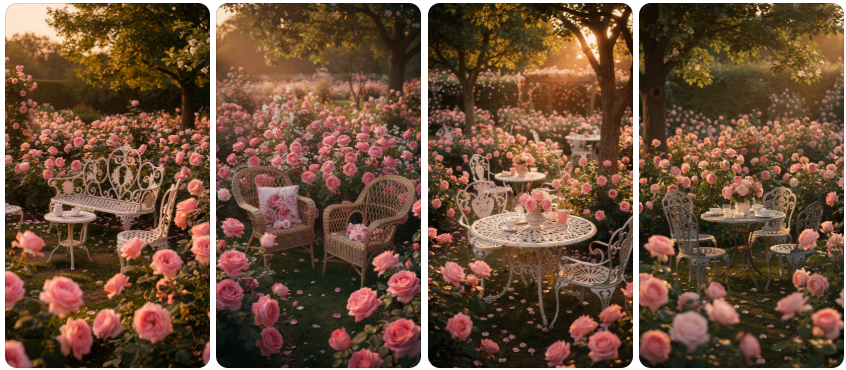
Rose pink captures the timeless beauty of fresh garden roses. Richer than blush yet softer than hot pink, this shade offers the perfect balance of femininity and sophistication. It is often associated with romance, love, and classic beauty, making it a favorite choice for weddings, floral arrangements, and elegant home décor. Its warm undertones create inviting spaces that feel luxurious and comfortable.
Interior designers frequently use rose pink as an accent color to introduce warmth into neutral rooms. Throw pillows, artwork, curtains, and decorative accessories in rose pink can instantly elevate a space without dominating the overall design. Combined with gold, brass, or natural wood elements, rose pink creates an upscale look that feels both contemporary and timeless.
On Pinterest, rose pink appears across countless aesthetic boards dedicated to cottagecore, vintage romance, and floral-inspired design. The color works beautifully in photography because it enhances natural light and complements greenery exceptionally well. Whether used in fashion, interiors, or event styling, rose pink continues to inspire creatives seeking a romantic and polished aesthetic.
3. Baby Pink
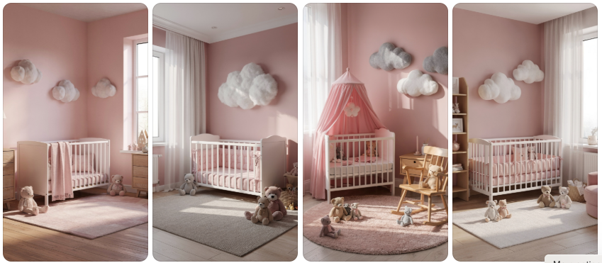
Baby pink is a light, airy shade that instantly evokes feelings of innocence, sweetness, and comfort. Often associated with childhood and gentle aesthetics, this shade remains a Pinterest favorite for nurseries, children’s rooms, and playful interior designs. Its soft appearance helps create calming environments that feel peaceful and welcoming.
The popularity of baby pink extends far beyond children’s spaces. Modern designers frequently incorporate it into fashion collections, beauty packaging, and social media graphics because of its cheerful and approachable nature. The shade pairs effortlessly with white, cream, and pastel colors, creating harmonious palettes that feel fresh and uplifting.
Pinterest users love baby pink because it photographs beautifully and complements current pastel design trends. Whether featured in home décor, fashion accessories, or stationery designs, baby pink offers endless creative possibilities. Its ability to brighten spaces while maintaining a soft and delicate appearance makes it a timeless favorite among color enthusiasts.
4. Hot Pink
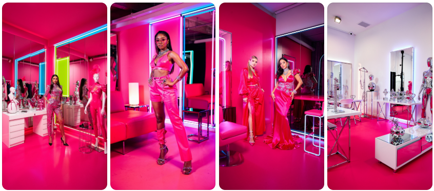
Hot pink is vibrant, energetic, and impossible to ignore. This bold shade commands attention and brings excitement to any project. Frequently associated with confidence, creativity, and self-expression, hot pink has become a staple color in modern fashion, branding, and digital design. It injects instant personality into spaces and visual compositions.
In interior design, hot pink is often used strategically through statement furniture, artwork, or accent walls. Because of its intensity, small doses can create dramatic visual impact without overwhelming a room. When paired with black, white, or metallic finishes, hot pink achieves a sophisticated yet playful aesthetic that appeals to contemporary design lovers.
Pinterest is filled with hot pink inspiration boards showcasing fashion shoots, bold room makeovers, and eye-catching event décor. Influencers and content creators often use this shade to create memorable visuals that stand out in crowded feeds. Its fearless energy continues to attract users looking for modern and expressive design inspiration.
5. Dusty Pink
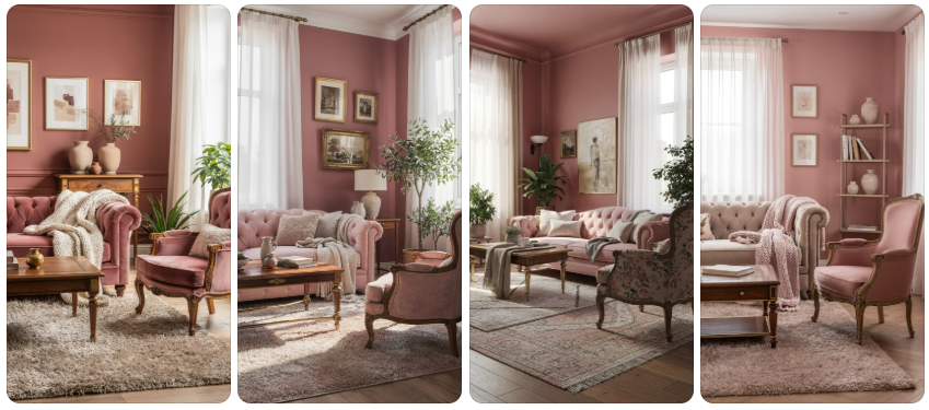
Dusty pink offers a mature and sophisticated take on traditional pink shades. With subtle gray undertones, this muted color feels refined, elegant, and highly versatile. It has become especially popular in modern interiors where homeowners seek warmth without excessive brightness. Dusty pink creates calming environments that feel stylish and welcoming.
Many designers appreciate dusty pink because it pairs beautifully with earthy tones such as taupe, sage green, charcoal, and natural wood. These combinations create balanced interiors that feel contemporary and timeless. The muted quality of dusty pink allows it to serve as both a neutral and an accent color depending on the design context.
Pinterest trends consistently highlight dusty pink in home décor, weddings, and lifestyle photography. Its understated beauty appeals to those who prefer subtle elegance over bold statements. Whether featured in textiles, paint colors, or floral arrangements, dusty pink remains a favorite among sophisticated design enthusiasts.
6. Coral Pink
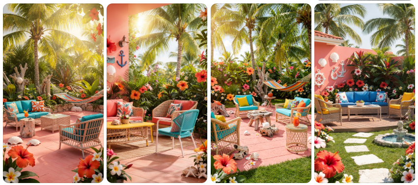
Coral pink combines pink and orange tones to create a vibrant, cheerful shade full of warmth and energy. Inspired by tropical landscapes and ocean reefs, this lively color instantly brightens spaces and designs. It is especially popular during spring and summer because it evokes sunshine, vacations, and outdoor adventures.
Home decorators often use coral pink in outdoor living spaces, accent walls, and decorative accessories. The color pairs exceptionally well with turquoise, white, and natural textures, creating fresh and inviting environments. Its energetic nature makes it ideal for spaces intended for entertaining and relaxation.
Pinterest users frequently save coral pink inspiration for tropical weddings, beach homes, and summer fashion collections. The shade’s lively appearance photographs beautifully in natural light and adds instant vibrancy to visual content. Coral pink remains a favorite for anyone seeking a fun and uplifting color palette.
7. Bubblegum Pink
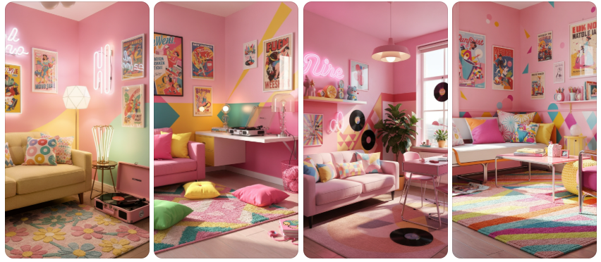
Bubblegum pink is playful, youthful, and bursting with personality. This bright and cheerful shade instantly creates a fun atmosphere that appeals to all ages. Its vibrant appearance makes it a popular choice for creative spaces, trendy cafés, social media backgrounds, and fashion-forward interiors.
Designers often use bubblegum pink to introduce a sense of joy and optimism into their projects. The color works especially well with white, turquoise, lavender, and other vibrant hues. Together, these combinations create energetic palettes that feel modern and highly engaging.
Pinterest trends frequently showcase bubblegum pink in retro-inspired room makeovers, colorful office setups, and playful event designs. The shade’s cheerful personality encourages creativity and self-expression, making it a favorite among content creators and design enthusiasts seeking bold visual impact.
8. Salmon Pink
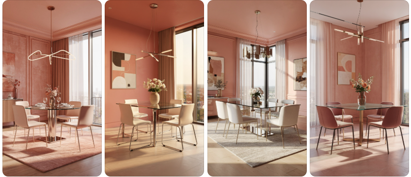
Salmon pink blends pink and peach tones to create a warm, welcoming color that feels both sophisticated and approachable. This shade offers more depth than lighter pinks while remaining soft enough to maintain a relaxed atmosphere. Its warmth makes it particularly appealing for interiors and lifestyle photography.
Interior designers often use salmon pink to add subtle color to dining rooms, living spaces, and bedrooms. The shade complements natural materials beautifully, including wood, linen, stone, and woven textures. These combinations create balanced environments that feel cozy yet elegant.
Pinterest users appreciate salmon pink for its versatility and timeless appeal. It works equally well in modern, rustic, and coastal designs. Whether used in wall colors, textiles, or decorative accents, salmon pink provides warmth and character without feeling overpowering.
9. Fuchsia Pink
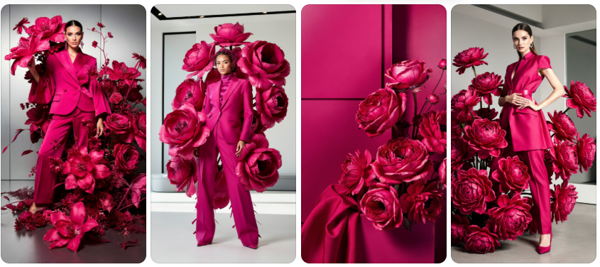
Fuchsia pink is bold, dramatic, and full of confidence. This vivid shade combines the energy of hot pink with deeper purple undertones, creating a luxurious and attention-grabbing appearance. It is often used when designers want to make a powerful visual statement.
In fashion, fuchsia pink appears frequently in runway collections, evening wear, and statement accessories. The shade exudes confidence and creativity while adding a touch of glamour to any look. Its rich tone works especially well in photography because it creates striking contrast and visual depth.
Pinterest showcases fuchsia pink in bold floral designs, luxury interiors, and contemporary art-inspired projects. The shade’s dramatic nature makes it ideal for creating memorable visuals that capture attention. For color lovers who enjoy standing out, fuchsia pink remains an irresistible choice.
10. Magenta Pink
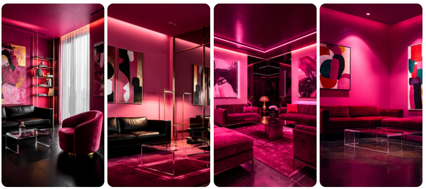
Magenta pink is a powerful blend of pink and purple that delivers both sophistication and energy. This striking shade has become increasingly popular in modern design because it feels innovative, artistic, and highly expressive. It immediately transforms ordinary spaces into visually exciting environments.
Design professionals often use magenta pink as a focal point in branding, interior design, and digital content creation. Its vibrant appearance captures attention while maintaining a polished and contemporary feel. Combined with dark neutrals, metallic accents, or rich jewel tones, magenta creates unforgettable visual compositions.
Pinterest users are drawn to magenta because it offers endless creative possibilities. From artistic room designs and bold fashion looks to eye-catching event décor, this dynamic shade inspires creativity and individuality. It serves as a perfect finale to any collection of beautiful pink tones, proving that pink can be both elegant and powerful.